I have a request for you, on behalf of the design community. Well, I haven’t really asked most of the design community, but I think many designers would agree.
We need your help. We need you to help us improve web design; to push it forward. I’ll explain, but first, let’s look at a picture.

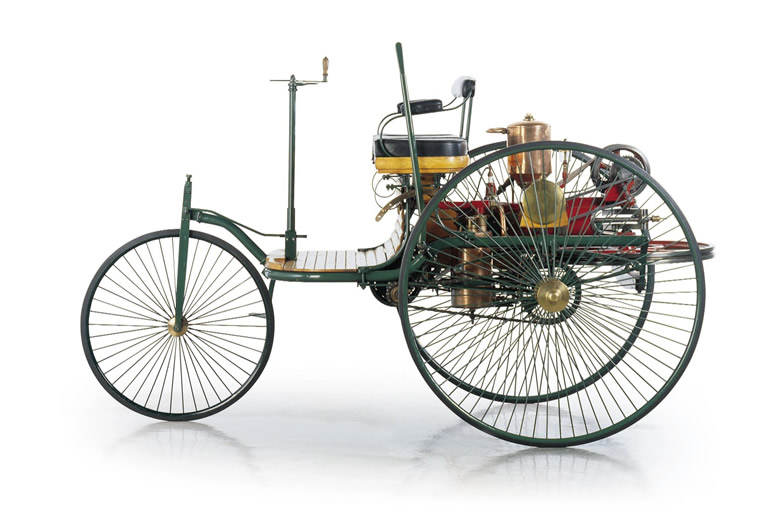
This is the Benz Motorwagen. It was designed by Karl en Bertha Benz in 1886 and it’s said to be the first car. Actually, there were other car-like vehicles before, but they were simply carriages where the engineers removed the horse and inserted an engine.
This car was the first one to be designed for use with an engine. Still, it looks very much like a carriage! Carriages were what everyone knew. It took some time for the engineers to get to know what kind of design works best with a motorized car. And for businesspeople to think of new uses for the car.
Horseless Carriage Syndrome
In the sixties Marshall McLuhan called this the Horseless Carriage Syndrome: new technologies start out by mimicking the old stuff. This is not necessarily a problem: it’s easier for people to understand a thing when it looks like something they’re familiar with. But after a while, this can become limiting.
Take for example the first GUIs for computers. The desktop metaphor was useful: it helped people understand what PCs could do. The PC desktop had folders with files in them, a calculator, a dustbin… just like a real desk. But by now, computers can do many things that have nothing to do with real world desks. Here, the metaphor becomes a burden.
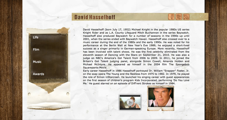
Now let’s have a look at web design. When I started out as a designer in the late nineties, it was very fashionable to use textured backgrounds in web designs. You know, a lovely crumpled paper texture, or a nice wood grain. I even found a design that uses both!
Beautiful, isn’t it?
And it’s not so strange we were doing this, because when you’re working as a print designer, you’re used to taking into account the properties of the materials you’re using. You can choose from many different kinds of paper, ranging from smooth and glossy to very coarse. This literally has a lot of influence on the design’s look and feel. Computer screens however are always the same: cold and hard. This wasn’t easy for us designers! And perhaps it wasn’t easy for our audience either.
As you probably know, this habit of making a website or an interface look like a physical object is called skeuomorphism. And we probably all needed some of this while getting used to digital design. Of course, the past couple of years there have been lots of debates on skeuomorphism and now, for better or worse, it’s dying. So the question is: what comes next?
Knowing your materials
I believe that good design comes from a solid understanding of the materials you’re working with. For a long time, for designers this more or less came with the job. Before the 20th century “graphic designer” didn’t exist as a separate profession. The person producing the work was also the designer.
So in the Roman empire, the person cutting an inscription in a monument was also the designer. And after the printing press was invented, the people working the presses were themselves designing the products they printed.

From the 1950’s, when advertising really took off, design became an actual job. But even after that, designers generally knew very well how a printing press works, how to use different kinds of inks and paper, book binding techniques etc. The printing world is very slow and conservative, so this was always quite doable.
The digital world, on the other hand, is entirely different. And that, my dear front-enders, is why we need you. I think we all know the debate about whether designers should code. I’m not going into that, because I think this discussion is useless. It’s great if a designer can code, but many of them can’t and they’ll probably not start learning it just because you say so.
But still, designers need to stay up to date in order to produce good work. They should understand how web pages work, what can be done with HTML, CSS and JavaScript – and also what’s not possible.
Because the thing is, designers will design. And after taking care of the clients’ wishes and the end users’ needs, after thinking about concepting and branding and usability, they also simply like to try new things. And to experiment. Many designers visit websites that showcase interesting design, such as It’s Nice That, countless webdesign galleries and even Pinterest. And if they see something they like, they’ll probably try something similar. Even if it means you will have to use 5 JavaScript libraries, 8 webfonts and 500 mb of pictures to build it. Sure, you can complain about that, but by then the designer has probably already fallen in love with their design. And if you’re really out of luck, their client has, too.
Does it fit the medium?
The problem with these design websites is they never explain how something was built and if a design makes sense from a technical point of view. If you’re not a front-ender, it can be really hard to tell if a certain effect or design solution is difficult to build and maintain, or bad for performance. In other words: whether it’s an elegant solution that really fits the medium. Or, in other words: whether or not you’re looking at a horseless carriage.
But let’s talk about you. And you, on the other hand, are probably visiting different sites. Places like A List Apart and Smashing Magazine, where you hear about CSS3 features that you can finally use, or perhaps a new lightweight JavaScript library that’ll let you do really cool stuff. And of course you’re here, spending 2,5 days discussing cutting-edge front-end development.
It’s interesting, isn’t it? Both you and the designer want to experiment. You’re both looking for new ideas. Wouldn’t it be better if you were both experimenting with the same things?
Stay in touch with your designers
There are some things you should try. First of all: make sure you stay in touch with your design colleagues, especially in between projects, when there’s no pressure. And whenever you learn something interesting, let them know. “Look, I’ve found out how to build these lovely animations!” Or: “Hey, did you know I can now do gradients with CSS, so I won’t be so unhappy anymore when you use them in your designs?”
With a couple of colleagues I run Achter het Scherm, an interview website (in Dutch) about workflow. For this website we’ve recently spoken to a number of designers and developers, and asked them how they keep each other up to date. And they had some great ideas you could try, if you aren’t, already.
Some have a company-wide mailing list. Some do short meetings every now and then where everyone shows what they’re working on and what they have learned. Some have multidisciplinary blogs. Some use communication tools such as Slack (❤). Some simply sit next to each other and talk. Try all these things.
Just think about it. You’re here at Fronteers, immersing yourself in front-end development. How will you share the things you’ve learned here with your colleagues back home? If you make a point of educating your designer friends, then hopefully you’ll find that they start using your suggestions. This will make your job more fun, and the resulting work will improve.
I realize what I’ve been saying here is not new. It just think it needs to be said more often! Designers really need you, even if we don’t always realize this ourselves.

